The short answer
Open Image to ICO, drop in a square picture of at least 256 pixels, leave the preset on Website favicon, and download favicon.ico. Put it at the root of your site, so that it answers at https://yoursite.com/favicon.ico. That address is asked for by every browser whether or not your HTML mentions it, so there is nothing else you strictly have to do.
Everything below is the part that makes the difference between an icon that is technically present and one that is legible: which sizes go in, what iPhones and Android ask for instead, and what to do when your logo does not survive being sixteen pixels across.
Why it is a set of sizes rather than one picture
An .ico file is a container. Inside it are several complete pictures of the same thing at different sizes, and whatever is reading the file picks the one closest to the size it needs.
That sounds like redundancy and it is not. A browser drawing your icon at sixteen pixels has two options: read a sixteen-pixel version you drew, or shrink a larger one on the spot. The second is worse, and visibly so — an automatic shrink of a detailed logo produces mush, whereas a sixteen-pixel version you looked at is something you had the chance to simplify. The whole reason the format holds several sizes is to give you that chance.
Three sizes is the convention for a website, and each has a reason:
- 16×16 — the browser tab, the address bar, the bookmark menu. This is the one people see. If you only get one right, get this one right.
- 32×32 — a bookmark bar, a Windows desktop shortcut to your site, and most browsers on a high-DPI screen, which draw the tab icon from 32 and scale it down.
- 48×48 — what Google reads a site icon at for search results, and Windows’ medium icon view.
Anything larger belongs in a PNG beside the .ico, not inside it, for reasons that come up under the mobile files below.
The sixteen-pixel problem
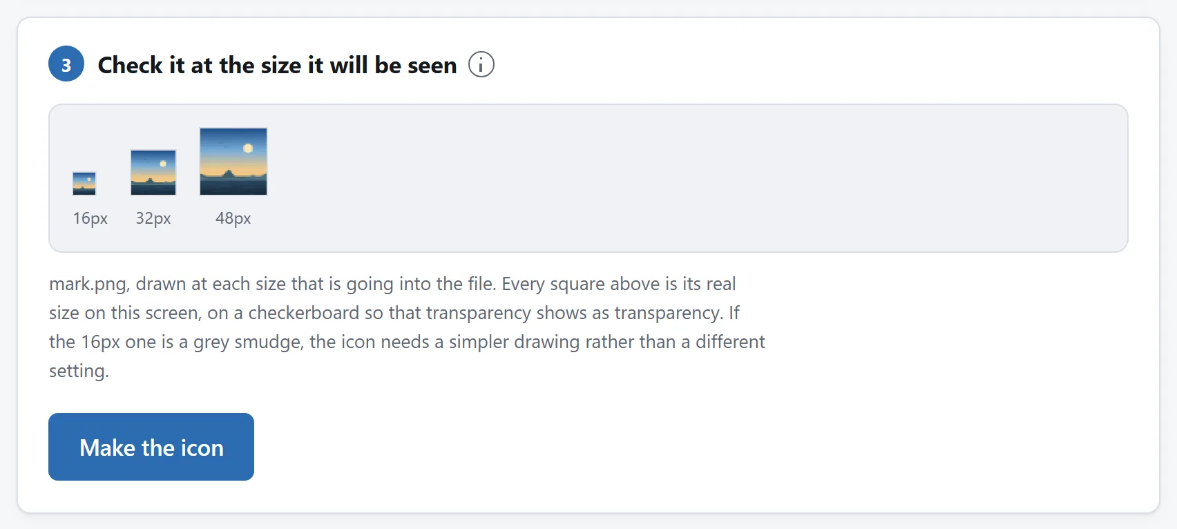
This is the part nobody warns you about. Sixteen pixels is about four millimetres on a normal screen: a grid of 256 dots in total, fewer than the letters in this sentence. Almost nothing that was designed to work on a sign, a business card or a website header survives being reduced to it.
What disappears, in order:
- Text. A wordmark shrunk into a square is around three pixels tall. It does not become small text, it becomes a grey bar. This is why almost every company that has a symbol as well as a name uses the symbol alone as its favicon, and why the ones that do not have a symbol use a single letter.
- Thin lines. A one-pixel border on a 512-pixel logo is one thirty-second of a pixel at sixteen. It renders as a faint grey haze along the edge, or vanishes.
- Gradients and shadows. There is no room for a transition. A soft drop shadow becomes a dirty fringe.
- Detail inside detail. An icon of a document with writing on it becomes a rectangle with a smudge.
The fix is not a setting, it is a different drawing: a simplified mark with one or two shapes, high contrast, and no text beyond a single character. Draw that version at 32 or 48 pixels deliberately, and use it as the source.
What a tool can do is show you the problem before you publish it. The preview in Image to ICO draws every size at its real size on screen, which is the only way to judge this — a sixteen-pixel icon displayed at sixty-four looks fine and tells you nothing.
Your logo is not square. Pad or crop?
An icon is always square, and most logos are not, so something has to happen. There are three answers and they are not equally good.
Padding keeps the whole picture and puts space above and below it. It is the safe default and the wrong choice for a wide wordmark: fitting something three times wider than it is tall into a square leaves it occupying a third of the height, which at sixteen pixels is five pixels of logo and eleven of nothing.
Cropping to the middle takes the largest square out of the centre. For a lockup — a symbol with the company name beside it — this often cuts straight through both. Better to crop the source yourself first, down to the symbol alone, and then convert that.
Stretching squashes the picture to fit. There is almost no situation where this is right, and it is offered mainly so that the tool is not silently doing it.
The general answer for a wide logo: do not convert the logo. Convert the part of it that works on its own.
Transparent or a solid background?
Transparent is usually right for a website. Browser tabs are grey, white or near-black depending on the browser and the theme, and a transparent icon sits on all of them. An icon with a white background painted in is a white rectangle in a dark tab bar.
Two exceptions worth knowing:
- A logo that is dark and nothing else disappears in dark mode. If your mark is black on white by nature, give it a coloured background rather than a transparent one, or a light outline.
- The Apple touch icon must be opaque. iOS draws it on its own rounded tile and renders transparency as black. Any tool that produces that file should be flattening it for you; the one here does, onto white by default.
The files a website needs that are not the .ico
favicon.ico covers browsers and Windows. It does not cover phones, and this is where most homemade icon sets stop too early. Three other platforms ask for their own files, by their own names, and none of them will look inside an .ico:
- iOS reads
apple-touch-icon.pngat 180×180 when somebody adds your site to their home screen. Without it, iOS uses a screenshot of the page, which looks like a mistake. - Android and every install prompt read a web app manifest —
site.webmanifest— which points at 192 and 512 pixel PNGs. The 512 is also what a web app shows on its splash screen. - A Windows Start menu tile reads
browserconfig.xml, which points at a 150×150 PNG. The smallest of the three in importance, and four lines of XML.
There is one more that is easy to get wrong: Android launchers crop an adaptive icon to whatever shape the phone likes — circle, squircle, rounded square — and only the middle 80% of the image is guaranteed to survive. An icon drawn edge to edge loses its corners. That is what a maskable icon is: the same picture drawn deliberately small inside the square, declared separately in the manifest.
Ticking the website set in Image to ICO produces all of these, the manifest, and the block of HTML that points at them. One thing that block deliberately leaves out is a <link> for favicon.ico: browsers request that address by themselves, and naming it as well makes the same file get fetched twice.
A Windows application icon is a different set
If the icon is for a program rather than a site, the sizes change. What Visual Studio’s own default app.ico contains is 16, 32, 48 and 256 — the three shell sizes plus the large one that the Start menu and Explorer’s extra-large view draw from.
On a high-DPI display Windows also asks for 20, 24, 40, 64 and 96, and resamples them from the nearest size it has when they are missing. Whether that matters depends on your icon: a flat shape survives the resample, a detailed one does not. Adding them roughly doubles the file, which for an application is nothing at all — the calculation is completely different from a favicon, where the file is fetched by every visitor.
One more thing about size: the 256 entry is where the bytes are. Stored uncompressed it is 264 KB on its own; stored as PNG inside the icon it is usually under 30. PNG entries have been readable since Windows Vista, so the only reason to avoid them is software genuinely older than that, or an installer or embedded tool that parses icons itself.
A Mac reads a different file entirely
If the icon is for a Mac application rather than a Windows one, none of the above applies: macOS does not read .ico at all. It reads .icns, which is the same idea in a different wrapper — several sizes in one container — with three differences worth knowing.
- The sizes are fixed. Apple publishes ten slots and there is nothing to choose: 16, 32, 64, 128, 256, 512 and 1024 pixels, with 32, 256 and 512 appearing twice because each is both a size of its own and the Retina version of the size below.
- It goes up to 1024. An
.icostops at 256, which is why a Mac icon file is several hundred kilobytes and a favicon is fifteen. For an application shipped once that is nothing; it is only a favicon that gets fetched by every visitor. - 1024 pixels is what your artwork has to survive. The two problems are opposite ends of the same picture: a favicon has to work when it is tiny, and a Mac icon has to hold up when it is huge. A logo exported at 512 and blown up to 1024 looks soft on a Retina display, and the App Store will not take it.
To use one: an application bundle keeps it at YourApp.app/Contents/Resources/ and names it in Info.plist. For a folder or a disk image, select the .icns in Finder, press Command-C, then Get Info on the thing you want to change, click the small icon at the top left and press Command-V.
Ticking macOS icon in Image to ICO writes one, with or without the Windows file beside it. Anything shipped on both platforms wants both, and both are drawn from the same picture in the same pass.
Checking that it worked
Browsers cache favicons harder than almost anything else, so “I uploaded it and nothing changed” is usually a cache rather than a mistake. Two things to try before you start editing files again:
- Open
https://yoursite.com/favicon.icodirectly. If the file downloads, it is there and you are looking at a cache. If you get a 404, it is not at the root. - Load the site in a private window, which usually has its own icon cache.
On Windows, an .ico can be checked by putting it in a folder and switching Explorer through its view sizes: small, medium, large and extra-large draw different entries out of the same file, so you can see each one as the system will.
On a Mac, an .icns opens in Preview, which lists every slot down the side — and the same trick works in Finder: drop it in a folder and drag the size slider in the view options to watch it swap between the pictures inside.
None of this needs an upload
Scaling a picture is something every browser has done for years, and an .ico is a six-byte header, sixteen bytes per image, and then the images. There is no step in making one that requires a server, and the tool here does not use one: the page's Content-Security-Policy names every address it may contact, and none of them belongs to this site.
That is worth caring about here more than usual. A logo handed to a free favicon generator is, quite often, an unreleased brand — the icon is one of the first things made and one of the last things announced. Load the page, unplug from the internet, and make one anyway if you would rather check than be told. Is it safe to upload files to online converters? sets out three more checks you can run on any tool.